Mustn’t Grumble: Introducing The First World Problem Jar

One of the best virals we’ve seen recently is this.

It’s so good that Nat and I created a real ‘first world problem jar’ in its honour out of a Cadbury’s eggbox. Here she is, next to Billy the Sellotape Dispenser.

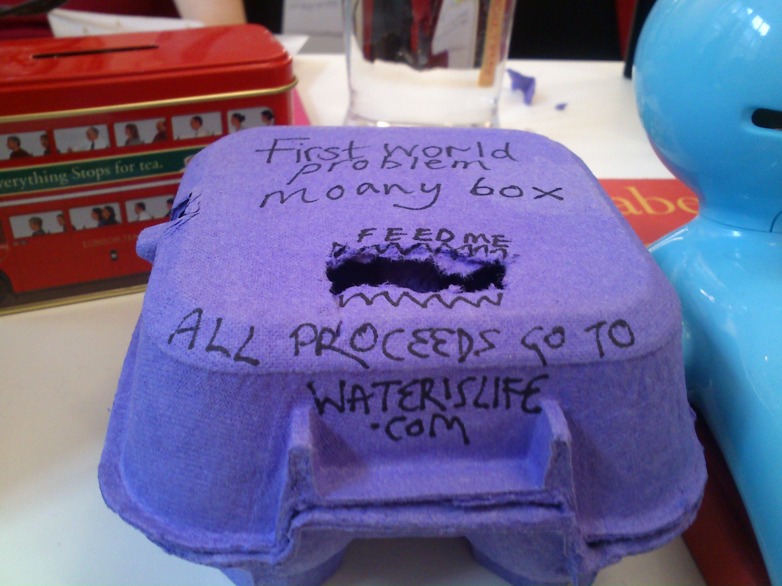
So for the last few weeks, every time we find ourselves doing a first world moan, we put money in the moany box. Anyone in the office is allowed to enter. Then every few months, we count up the money and pay it in directly to WaterisLife.com

Here are just a few of the RIDICULOUS AND ENTIRELY UNACCEPTABLE first world moans that we have overheard here in these four walls.

I hate when…The fruit’s delivered late.

I hate that….Not one of the brands of staples in this building actually FIT the staplers. So when using them, they’re all that tiny bit too large and get stuck. (something we often find ourselves moaning about when trying to extrapolate a bent stapler from a finger and/or an A4 page.)

I hate that…Since we moved desks, we now have to walk ALL THE WAY UPSTAIRS to go to the loo.

And finally; this one is the absolute worst. The other day ‘some creatives’ went for a wrap lunch at one of the ‘trendiest’ restaurants in london, and ordered a celebratory Bellini. It came in a common-or-garden tumbler shaped glass and everyone couldn’t help being disappointed that it wasn’t in an ACTUAL champagne glass?

Unacceptable. Rest assured that everyone involved has now sufficiently off-set their pathetic whines!

If you find yourself doing a first world moan – whether aloud or internally – we’d be happy to help absolve you.

You can now donate in a virtual capacity by commenting or tweeting @loreleimathias and I’ll put some coins in for you.

That’s right, I have finally given in and joined the tweeting masses. If you’re so inclined you can follow my ramblings of little consequence here.


SANS HUMOUR

A constant fascination of mine (and I don’t think I’m alone in this…) is the over-zealous use of the font Comic Sans.

I (lol) have a theory that Comic Sans is to the world of typography what the exclamation mark is to punctuation. In other words, it’s like laughing at your own joke!

The irony is, The Sans isn’t funny to look at (it’s actually pretty gross isn’t it?). It is only comic when it’s used in situations where humour really has no place.

So for the last year, for no real reason, I’ve been collecting the silliest uses of this self-proclaimed Funny Font. Examples which are funny, but probably not in the way the typographer intended. Like these little chaps.


Fig 1. A friend’s correspondence from her accountant 
(you might need your reading glasses for this one, but it’s worth it. If nothing else he also uses the phrase ‘going forward’:


Fig. 2. A lecture on particle physics
(OK, so I wasn’t there for this one. I found it on the internets)


Fig. 3. A letter about a smear test from a DOCTOR’S surgery in Sweden:

(Fitzgerald would be vomiting in if he saw this one, it’s got exclamation marks in it TOO!)


Fig. 4. Gang warfare in North London:


Fig. 5. A holy church in Bethnal Green:


Fig. 5.
 A business hotel in Singapore 

For me though, the worst offender is actually this one:


Fig. 6.
Some ‘handouts’ given to us on a COMEDY course. (Needless to say that it wasn’t the most insightful course on the inner subtleties of humour. But you’ll clock that for yourself when you read point two).


Another one which I do not have physical evidence of but have it on good authority: A leading fiction publisher told me the other day that he often receives submissions written in Comic Sans. Needless to say they go straight in the bin.

Lastly, some time ago a friend of mine was living in Nepal and she unfortunately needed a brain scan. Luckily the results were fine and there was nothing to worry about. But the MRI results were written in you guessed it – the sans.

I experimented with writing this whole blog in comic sans, but I just couldn’t take it seriously. It all turned self-referential to the point where I felt a bit giddy.

Anyway, am I over-reacting, or can anyone defend the funny font? Is it ever appropriate?

Just before posting this, I learned that I’m not alone; that there exists someone even nerdier than me.  A bloke called Matt Dempsey has begun to police the streets and stamp out comic crimes, reminding us all that it is only relevant to an audience below the age of eleven; not a day older.

I would add that it’s only relevant to people still living in the 1980’s, but that’s just me (!)


Suburban Banksy and foreign supermarkets…

…are just two of our favourite things.

At the end of last year we were asked to write a piece for the IPA about what inspires us.

Which was very flattering. The only snag was that, work being work, we didn’t have very long to do it in. So mine (Lol) ended up about six pages too long. But as Pascale and every great rambler knows, it takes a lot longer to write short things than it does long things!

Not only that, for some unholy reason I have left out two of my favourite screenwriters…

1) Aaron Sorkin – the patron saint of razorsharp dialogue. Although he’s most known for The Social Network, his best work (in my humble opinion) is Studio 60 on the Sunset Strip. Get the box set if you’ve not seen it!

2) Bruce Robinson, the brilliant brilliant writer of How to get a head in advertising and Withnail and I. I really recommend reading the screenplay – it’s astonishingly written, and there are even more hidden gems in his stage directions.

All disclaimers aside, for anyone that’s interested, here is our piece on what inspires us as a team.

Thank you and a belated happy new year one and all…

L & N x