
The new three mobile campaign is SO good! But who did it please?
Would love to know. If you’ve not seen it yet…
Update update:
It was Weidens. But that said, here is probably the best sequel to an ad ever made
The new three mobile campaign is SO good! But who did it please?
Would love to know. If you’ve not seen it yet…
Update update:
It was Weidens. But that said, here is probably the best sequel to an ad ever made
Back in December, I (Lol) went to Melbourne. Before going, I remember hearing on the news about Australia’s new approach to cigarette packets. I wasn’t quite prepared for what I saw though… (lily livered among you look away now)


But it wasn’t the horrific imagery that I found so surprising. Because, as everyone knows, the more you see something shocking, the less and less impact it has, to the point where it eventually becomes a bit…, well, non. As if to prove this, the Aussies I was out with spent very little time being shocked by the packets, and most of the time inventing amusing games with them.

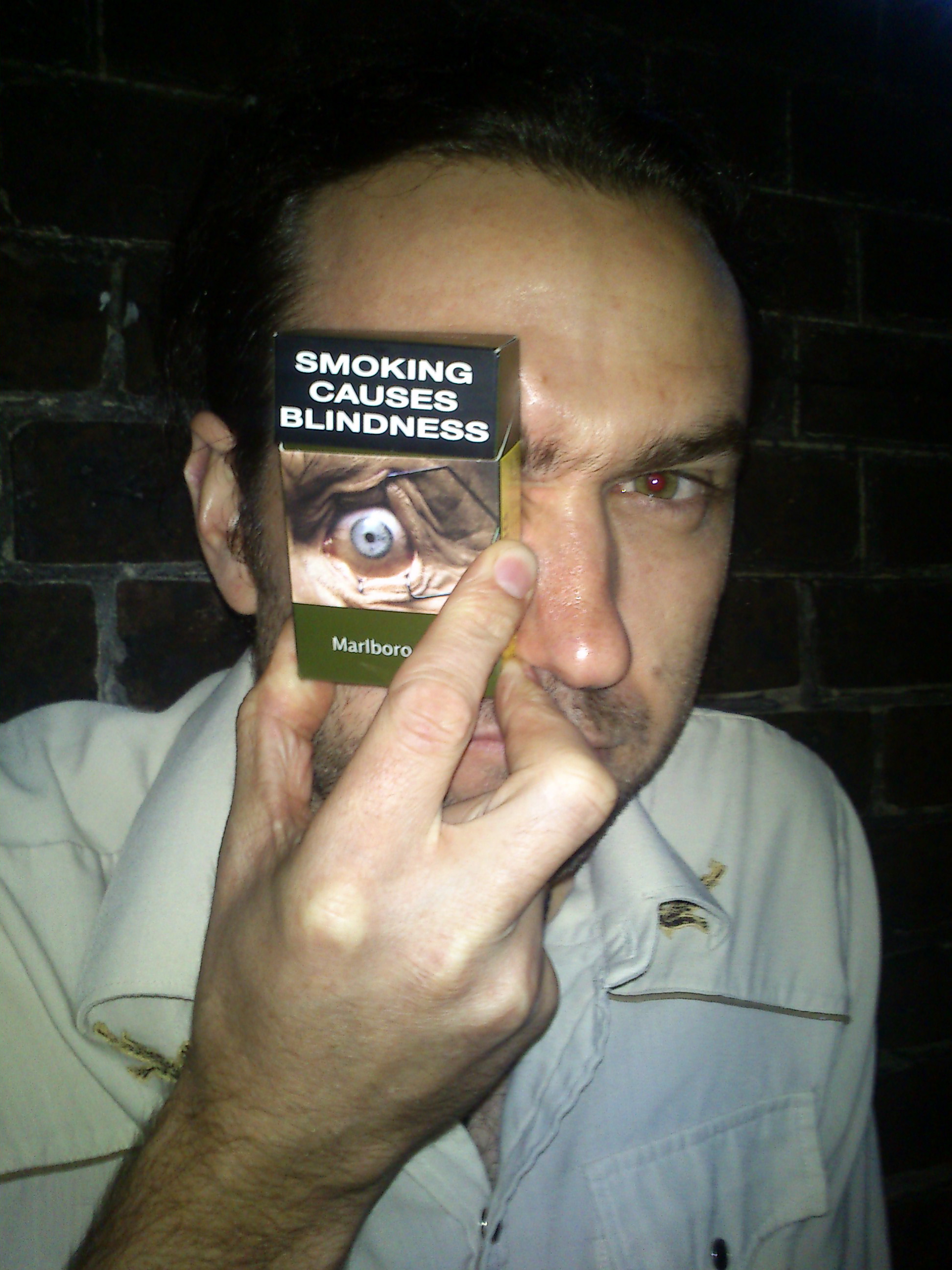
Grim visuals aside, it was actually the sight of all these brands with all that heritage now being homogonised that shocked me the most, now that all tobacco branding has been outlawed in Australia.
Possibly this is an occupational hazard and will sound ridiculous. But in a strange way, I couldn’t help but pity the people who had spent so long creating the identity – choosing the type (definitely not comic sans!), the font size, the colour, the weeks, months spent in research, and now being told it must uniformly always be Arial 12. Or whatever it is on these packs.
I’m not really a smoker, but it was strange to think of where this left brand loyalty… they were now just ‘CIGARETTES’, plain and simple, not:

or

Although it’s not been bad for everyone. As Dave (the guy with the gammy eye above pointed out), Bond Street Cigarettes actually look classier now with the new design. They didn’t spend much on graphic design before, so in design terms, the new look has been something of an upgrade. Although I can’t find any physical evidence of this, so we’ll just have to take Dave’s word for it.
Let’s hope the scary new packs help, either way.
Last Thursday was a very special day.
The annual Beattie McGuinness Bungay Woo-Off.
Where for one day only the whole agency transforms to a rose-scented, chocolate covered, serenading carnival of competitive-loving.
Not because we love each other but because we all want to win dinner for two at Hawksmoor.
The winner was a very filthy poem by the comically genius fingers of ‘Jamie I’.

But our personal favourite was this email from ACTUAL CUPID himself!


Then there was this one which I was chuffed to receive in addition to a red rose and some Hotel Chocolat: A cryptic map and poem inviting me on a secret date with a man in a hat – a glass of bubbly at the Ivy no less.
nb – It was the correct way up until I uploaded it, when the blog programme made a point of flipping it sideways; much like my stomach once I’d been wooed by the lovely Sam Richardson here…

Finally, this one was very funny too. Stalking Lucy…
Of course, none of them came close to the amazing poetry blog from the clever Mr Bruce did last year, which even now has a special place in my heart – the creepy yet hilarious Poemsforlorelei
