A constant fascination of mine (and I don’t think I’m alone in this…) is the over-zealous use of the font Comic Sans.
I (lol) have a theory that Comic Sans is to the world of typography what the exclamation mark is to punctuation. In other words, it’s like laughing at your own joke!
The irony is, The Sans isn’t funny to look at (it’s actually pretty gross isn’t it?). It is only comic when it’s used in situations where humour really has no place.
So for the last year, for no real reason, I’ve been collecting the silliest uses of this self-proclaimed Funny Font. Examples which are funny, but probably not in the way the typographer intended. Like these little chaps.
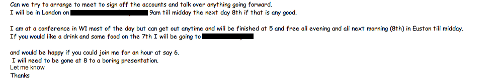
Fig 1. A friend’s correspondence from her accountant (you might need your reading glasses for this one, but it’s worth it. If nothing else he also uses the phrase ‘going forward’:
Fig. 2. A lecture on particle physics (OK, so I wasn’t there for this one. I found it on the internets)
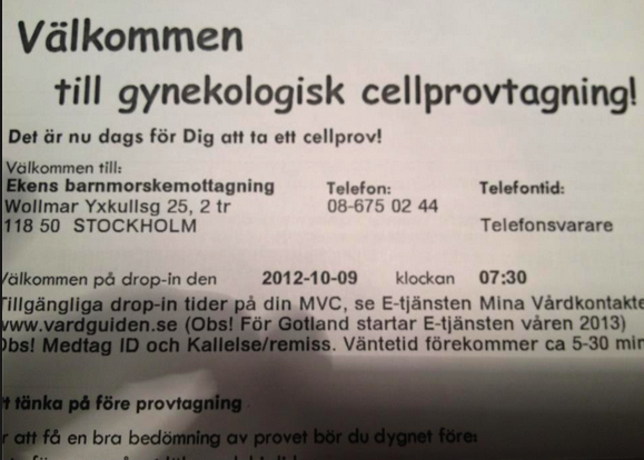
Fig. 3. A letter about a smear test from a DOCTOR’S surgery in Sweden:
(Fitzgerald would be vomiting in if he saw this one, it’s got exclamation marks in it TOO!)
Fig. 4. Gang warfare in North London:

Fig. 5. A holy church in Bethnal Green:

Fig. 5. A business hotel in Singapore
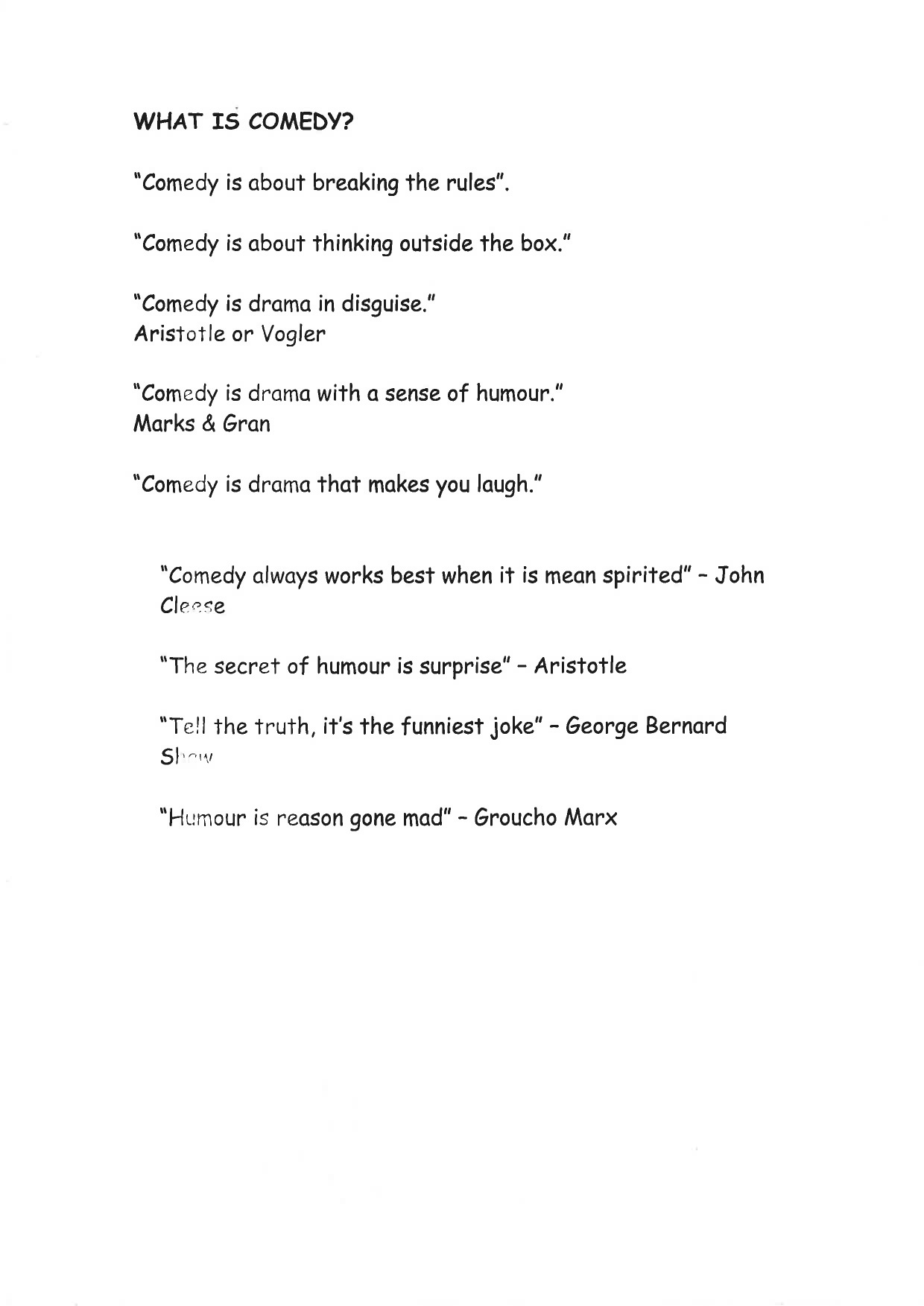
For me though, the worst offender is actually this one:
Fig. 6. Some ‘handouts’ given to us on a COMEDY course. (Needless to say that it wasn’t the most insightful course on the inner subtleties of humour. But you’ll clock that for yourself when you read point two).


Another one which I do not have physical evidence of but have it on good authority: A leading fiction publisher told me the other day that he often receives submissions written in Comic Sans. Needless to say they go straight in the bin.
Lastly, some time ago a friend of mine was living in Nepal and she unfortunately needed a brain scan. Luckily the results were fine and there was nothing to worry about. But the MRI results were written in you guessed it – the sans.
I experimented with writing this whole blog in comic sans, but I just couldn’t take it seriously. It all turned self-referential to the point where I felt a bit giddy.
Anyway, am I over-reacting, or can anyone defend the funny font? Is it ever appropriate?
Just before posting this, I learned that I’m not alone; that there exists someone even nerdier than me. A bloke called Matt Dempsey has begun to police the streets and stamp out comic crimes, reminding us all that it is only relevant to an audience below the age of eleven; not a day older.
I would add that it’s only relevant to people still living in the 1980’s, but that’s just me (!)


